The reports page shows the current status of tickets at the top part and more in-depth history analysis metrics at the bottom.
Each metric consists of several charts, each showing data from a different angle or perspective. You can display each chart as pie, columns, or line charts.
Viewing Reports
To open reports:
- Click the Reports (Charts icon) in the top toolbar or press v then r.

- Scroll down to view all reports.
- Click the Pie icon or Columns icon to switch views between column to line charts.
- Filter the results using the pull-down filters – See options below in each chart type.
All charts can be displayed as Pie Chart or Columns Chart:
Summary Reports
The charts at the top part of the page show the current status of your open tickets. These charts can help you find out whether the team is overloaded and make decisions based on data.
Open tickets report
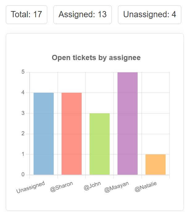
The open tickets reports include totals and charts as follows:
- Totals for open tickets. How many assigned and unassigned tickets are currently open.
- Chart of open tickets by assignee. See how many tickets are currently open for each person on the team. Get a quick insight on workload for each and see whether there are team members that are overloaded and perhaps distribute the work between other team members
- Chart of open tickets by team. See how many tickets are currently open for each team. The number of tickets by team can give you insight regarding which team is most loaded at the moment or which types of issues are open, e.g., support requests vs. finance-related ones.
- Chart of open tickets by mailbox. See how many tickets are currently open for each mailbox. The number of tickets by mailbox can give you insight regarding the channel and team that may be most loaded at the moment.
- In the Show by section under the chart
- Select the view between Current mailbox or Original mailbox.
Analytics Reports
Analytic reports help you monitor the volume of tickets and explore your team’s activity by date.
Analytics reports use metrics and date filters.Use the pull-down menu to pick the metric and the period you want to explore.
The Analytics reports (metrics) include:
- New tickets analytics report.
- Closed tickets analytics report.
- Messages sent analytics report.
- Messages received analytics report.

The totals in the charts are displayed in different time frames depending on the period you choose. For example, selecting “Last 7 days” will show the daily totals. Choosing “Last 4 weeks” will show the weekly totals. And choosing “Last 12 months” will show the monthly totals.
New tickets analytics report
The New tickets metric generates a report that shows the number of tickets that users or customers created in the period you select. To view the new tickets report:- Scroll down to the analytics reports area.
- Select the New tickets metric.
- Select the time frame from the pull-down menu on the right.
- View results.
Results show the total number of new tickets in the selected period.
In addition, you will see four charts:
- Tickets added Summary chart. View all tickets that users or customers created in the period you select.
- Tickets added By assignee chart. View all tickets that users or customers created in the period you select, arranged by the assigned team member. You will see how many new tickets were assigned to each team member and identify peak times, changing workloads, and ways to improve efficiency.
- Tickets added by team chart. View all tickets users or customers created in your selected period, arranged by their team. Reviewing the number of new tickets for each team will help you understand how your team is performing and which teams may require more attention and resources.
- Tickets added by mailbox chart. View all tickets users or customers created in your selected period, arranged by their mailbox. You will be able to see trends and compare mailboxes to see which channel uses more workload than others.
- In the Show by section under the chart
- Select the view between Current mailbox or Original mailbox.
To switch the mailbox views:
Closed tickets analytics report
All tickets that were closed in the period you select. The closed tickets metric generates a report showing the number of closed tickets in the period you select.To view the closed tickets report:
- Scroll down to the analytics reports area.
- Select the Closed tickets metric.
- Select the time frame from the pull-down menu on the right.
- View the results in the charts as explained below.
- tickets closed Summary chart View all tickets that were closed in the period you select.
- Tickets closed by assignee chart View all tickets users closed in the given period, arranged by the assigned team member or the person who closed the ticket (it can be a different team member). You will see how many tickets were closed by each team member and identify peak times, workload, and efficiency.
- In the Show by section under the chart
- Select the view between Assignee or Closed by user.
View all tickets users closed in the given period arranged by their team. Reviewing how many tickets were closed for each team will help you get insights into how your team is performing while handling different types of requests, e.g., support issues vs. billing matters. - Tickets closed By Mailbox chart
View all tickets users closed in the given period, arranged by their mailbox. The mailbox can be the original one or the one linked to the ticket at the moment (if the mailbox has changed between creating and closing the ticket).
To switch the mailbox views:- In the Show by section under the chart
- Select the view between Current mailbox or Original mailbox.
To switch the view user view:
Messages Sent analytics report
The Messages Sent metrics show all outgoing messages (including new tickets and public replies sent to customers) in the period you select.To view the Messages Sent report:
- Scroll down to the analytics reports area.
- Select the Messages Sent metric.
- Select the time frame from the pull-down menu on the right.
- View the results in the charts as explained below.
- Messages sent Summary chart. View the total amount of messages that users sent in the period you select.
- Messages sent By Assignee chart. View the number of messages that users sent in the given period, arranged by the team member that sent the message. You will be able to see how many messages were sent by each team member, learn about the efficiency of each member, identify peak times, and more.
- Messages sent By Team chart. View the number of messages users sent in the given period arranged by their team. Reviewing how many messages users sent for tickets with different teams will help you get insights into how your team is performing and which teams usually require more replies than others.
- Messages sent By Mailbox chart. View the number of messages users sent in the given period arranged by their mailbox. You will be able to see trends and compare mailboxes to see which channel users use more than others.
Messages Received analytics report
The Messages Received metrics show all incoming messages (including new tickets and customers’ public messages) in the period you select.To view the Messages Received report:
- Scroll down to the analytics reports area.
- Select the Messages Received metric.
- Select the time frame from the pull-down menu on the right.
- View the results in the charts as explained below.
Four charts will help you get insights about new tickets activity:
- Messages received Summary chart. View the number of messages that were received in the given period, grouped by month, week, or day, depending on the selected period
- Messages received By Assignee chart. View the number of messages received in the given period, arranged by the team member that received the message. You will be able to see how many messages were received to tickets assigned to each team member and realize the volume of customer messages they’d faced.
- Messages received By Team chart. View the number of messages received in the given period arranged by their team. Reviewing how many messages are received by the ticket’s team will help you get insights into the volume of incoming customer messages and consider how each team has to handle and adjust its resources accordingly.
- Messages received By Mailbox chart. View the number of messages received in the given period arranged by the mailbox they arrived through. You will be able to see trends and compare between mailboxes to see which channel has received more inbound workload than others.